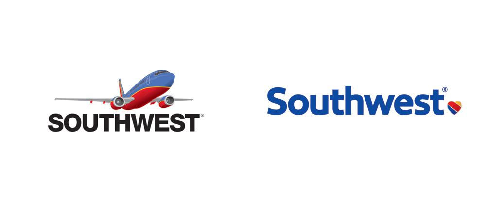
Southwest Airlines just announced a full brand/identity refresh, by Lippencott. Overall it’s a nice improvement over the stale, 90’s feeling previous identity. At first the heart feels a bit disconnected and random but when you discover it harkens back to the original Southwest Airlines logo from 1967 it makes more sense and adds a nice touch of heritage.

Along with the heart icon Southwest also used the “luv” theme to identify themselves and are even traded on the stock exchange under LUV. Lippencott has also resurrected the all but forgot LUV theme… “Without a heart, it’s just a machine”.
The new typography and use of color all seem to really work well together and make a bold statement that really pushes their brand forward while hinting at the past. All in all it’s a very nice improvement. These are big moves for such large companies with countless identity applications so you don’t see this kind of change happen too often as the financial ramifications are not for the faint of heart.
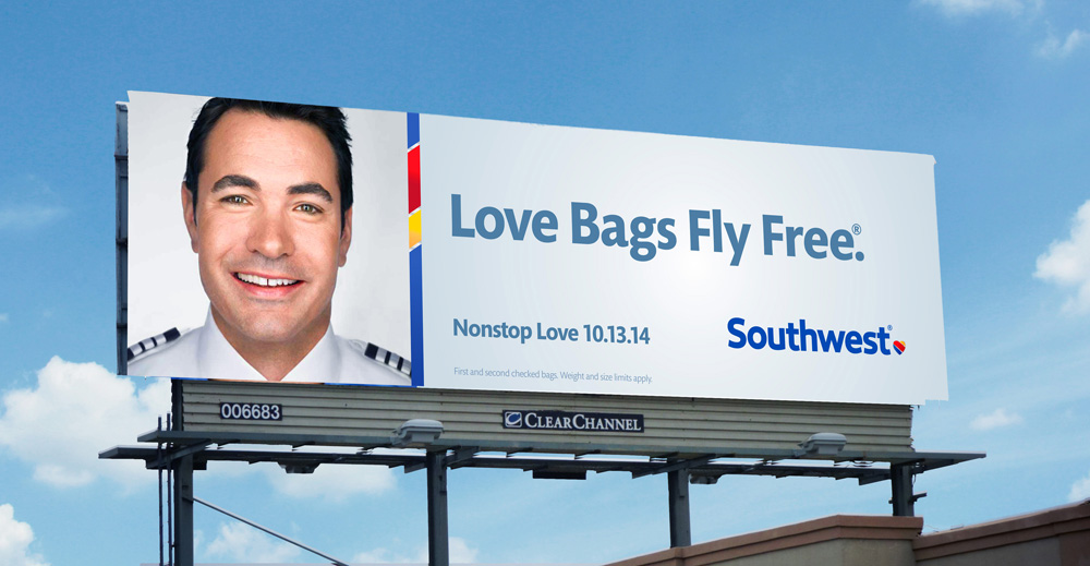
Still not so sure about “Love Bags Fly Free” however, seems like a person could read that one a few different ways other than maybe what was originally intended. – Read the comments at the bottom of the post on Brand New and have a chuckle or 2.
Share


